


In the course of our work locating and analyzing typefaces and typeface frequency across the last two centuries of Arabic script mechanical print we made some fascinating historical discoveries, including some striking typefaces whose existence we would not have previously suspected. Among these were a couple of early nasta’līq typefaces used by some of the pioneer presses in the Islamicate world, typefaces whose fortunes reveal a great deal about the dynamics and trajectory of Arabic script print from the dawn of typographic print up to our own age of digitized texts and OCR development. In what follows I will explore some of these dynamics and historical trajectory, focusing primarily on one of the small number of early nasta’līq typefaces, that of the Būlāq Press in Cairo.
At the dawn of print culture’s diffusion across the Islamicate world, a diversity of script styles were in use for the writing of Arabic script, from maghribī in North Africa to ṣīnī in the Qing Empire. That said, within the Ottoman lands and the post-Mughal Subcontinent, the two regions in which Arabic-script printing would first emerge in great force, two broad styles predominated: naskh and nasta’līq. To oversimplify things a bit, by the early modern period Arabic-language texts in the Ottoman world, the Iranian lands, and South Asia tended to be written in naskh (with variation from the naskh norm often mapping upon genre differences), while Persian-language texts tended to be written in nasta’līq. Ottoman Turkish texts varied, with poetic and belle lettres works often featuring nasta’līq, though many other genres could feature the script (or intermediate forms between naskh and nasta’līq) as well.
Well before the 1820 founding of the pioneering Būlāq Press in Muḥammad ‘Alī’s Cairo, Arabic-script typography had already undergone a long history of development, albeit a rather discontinuous one, primarily taking place in Western European cities with only sporadic attempts within the Islamicate world itself. The reasons for this situation are complex and need not concern us here, but suffice to say the vast majority, if not all, early modern Arabic-script typefaces looked to naskh models, even if the end results were not all that aesthetically pleasing or akin to the naskh hands then current in most of the Islamicate. The typography that would be developed in and for presses in the Arabic and Persian speaking lands themselves continued this trend of naskh-dominance, which in the Ottoman case owed as much to the general (though far from exclusive) predominance of naskh as a book-hand as to any inherent match between the technical limits of nineteenth century type production and setting and any one script style. That said, it was and is certainly the case that nasta’līq lends itself much less readily to metal typography, as the inherent issues with Arabic script compared to Latin script—a high number of possible ligatures, multiple necessary shapes for individual letter forms relative to their neighbors, the centrality of dotting, the matter of vocalization—are compounded with nasta’līq.
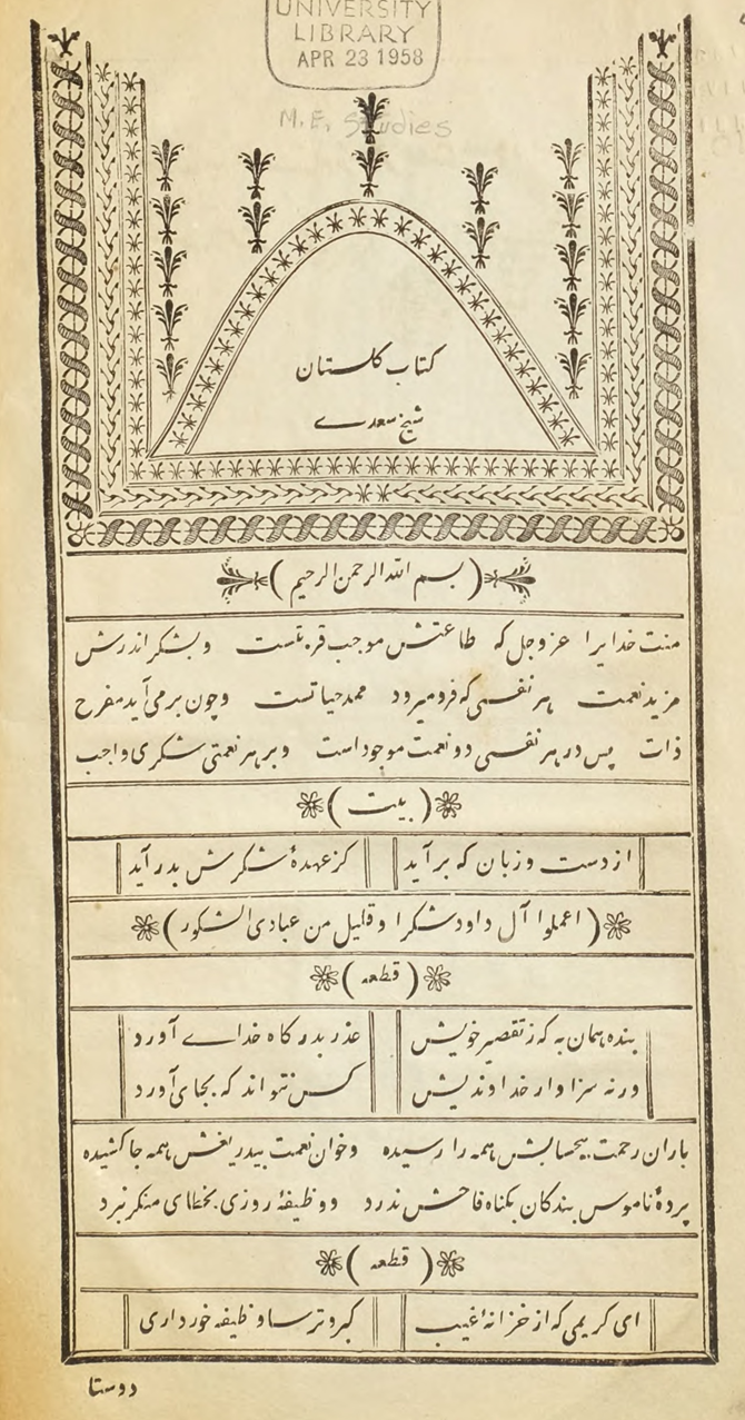 Figure 1. The opening page with headspiece from the Būlāq Press' 1844 printing of the Gulistān in their nasta'līq typeface.
Nasta’līq proved a rather poor and inefficient match for the industrial techniques of the nineteenth century, in other words, at least so far as metal typography was concerned (lithography would be another matter). That is not to say that at least some type-makers did not try: the Būlāq Press experimented with a nasta’līq typeface quite early on, printing both Persian and Ottoman Turkish works (much of the early production of Būlāq was in those languages, gradually shifting to Arabic dominance over the course of the nineteenth century). This typeface, along with a couple other attempts at nasta’līq which we have discovered in the course of our research, are indeed remarkable for the amount of work and skill that surely went into their initial production and then typesetting. In my own estimation, Būlāq produced some of the most beautiful books yet printed in Arabic script, approximating at times the elegance and lushness of manuscripts, as the following example, from the divan of the female Ottoman Turkish poet Leylâ Hanım displays in particular real extravagance:
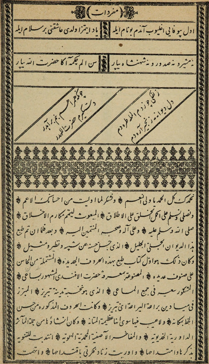 Figure 2. The 1844 printing of Leylâ Hanım's Divan by Būlāq.
Yet despite the clear level of investment Būlāq (and to a lesser extent a handful of South Asian presses as well) put into nasta’līq, by mid-century or so only naskh typefaces would be in use. It seems likely that the costs involved were ultimately prohibitive, even if other factors had not been in play. Compared to handwritten nasta’līq these typefaces are generally not as visually felicitous, either aesthetically or in terms of legibility (note the cramped spacing of the example below, for instance). The fluidity of nasta’līq in relation to the baseline and the space of the page was and is simply hard to capture with typographic technique, requiring a great deal of investment and labor to get things right. As a contemporary reflection of these underlying issues of legibility, our own attempts to incorporate these typefaces into our training data have been hampered by problems of legibility, now heightened by the age of the books and the resulting deterioration of print over time. We ultimately decided to not invest as much time in training data generation for these works as for others in our corpus, as—in an echo of nineteenth century printers—the necessary labor investment outweighs the relatively small number of works ultimately printed in these early nasta’līq typefaces.
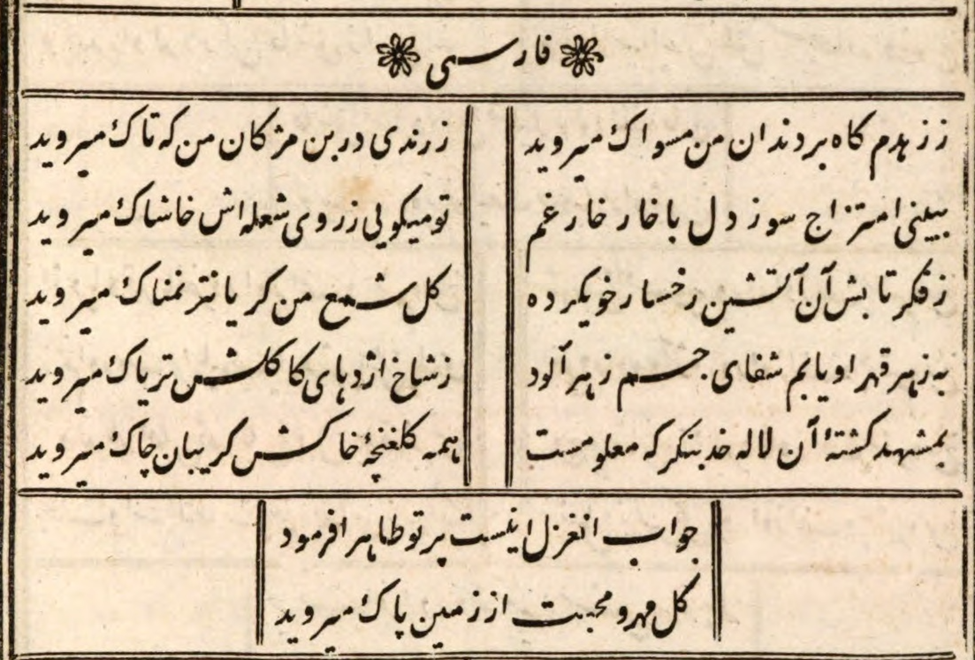 Figure 3. Ottoman Turkish rendered in nasta'līq: the divan of a late 18th c. Ottoman poet, printed by Būlāq in 1837. Note the differences in typesetting between this and the slightly later example above.
There were other factors contributing to the short time span of experiments with nasta’līq metal typography, perhaps more important in the long run (after all consumers purchased books printed in other less than ideal typefaces). In the Ottoman world, Persian was increasingly supplanted by French as the ‘foreign language’ of choice as the nineteenth century unfolded, and Persian was the language most strongly associated with nasta’līq, reflecting conventions in the rest of the Persianate cultural sphere. The most important factor however was the concurrent rise of lithography in the first half of the nineteenth century. While metal typography was long in being adapted for Arabic script usage, the application of lithography to Arabic script printing occurred almost immediately after the technology’s invention. It was of especial significance for nasta’līq: where metal typography was simply ill-suited for the script, lithography was as close to perfect as could be imagined, since scribes could continue to use their finely honed handwriting skills and the scripts with which they were used to writing, only now capable of being mass-produced. Tellingly, a second edition of Leylâ Hanım’s Divan was produced a few years after Būlāq’s, in Constantinople, but this time in lithography.
Interestingly—and worth exploring further at some point in the future—in the Ottoman lands naskh seems to have become all but totally dominant after the mid-nineteenth century or so, partially because naskh-style metal type became the norm, but also because of the relative decline of Persian as noted above, such that even lithographed texts were almost always in naskh. For while lithography was not uncommon in the Ottoman lands, it never achieved the dominance it would long have in the Maghrib, in Iran, in South Asia, and elsewhere. When it was used it tended to be for specific purposes: devotional works, for instance, were very often in lithographed form, for reasons of both cultural normativity as well as practical (fully vocalized texts did not render all that well in pre-digital Arabic typefaces, and most devotional texts are fully vocalized for purposes of recitation).
The rise to dominance in quite a few markets of lithography, and the dominance of lithography within certain genres of book in otherwise metal type-dominated markets, serves as a reminder of the contingent nature of the precise shape of industrial modernity and capitalism’s global expansion. This is a theme that deserves further unpacking, to be sure, and could well provide an important route into a rethinking of hegemonic modernity and trajectories of technology, against teleologies of inevitability and of a single arc of ‘progress.’
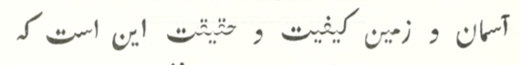 Figure 4. Another early nasta’līq typeface, developed in the late 18th century for the Calcuta Chronicle Press, run by Daniel Stuart and Joseph Cooper–note the lack of a firm impression on the two qāfs of ḥaqīqat.
In practical terms, our OCR accuracy rates for early nasta’līq typefaces are, for now with our existing routes of development, unlikely to ever rise as high as the accuracy rates for other typefaces; where our overall goal has been 97% and better character accuracy rates, early nasta’līq has remained in the 80s to low 90s–an achievement with a relatively limited training data set relative to most of our other target typefaces.All early typefaces tend to have material factors that reduce accuracy (quality of printing and decay of materials over time for instance, as in Figure 4), but the early nasta’līq typefaces are particularly problematic, and are further limited by a fairly small available corpus, digitized exemplars currently available to us only numbering in the dozens, almost all poetry, primarily divāns of individual poets. Unfortunately early nasta’līq typefaces have relatively few points of morphological contact with the one body of nasta’līq typefaces for which we have already had greater OCR success, late twentieth into early twenty-first Urdu typefaces that made nasta’līq work for typographic print, now in digital form. But that is another story for another time. For anyone who may attempt to OCR a text in one of these nineteenth century nasta’līq typefaces, be aware that a substantial degree of manual correction is likely to be necessary. If you find yourself making such corrections, however, do take time to think about the typemaking and typesetting work that went into making this small corpus of books, and imagine how Arabic typography may have turned out if lithography had not been invented when it was.